Lots of scholarship has examined shifts in attitudes toward gender and sexual minority populations. I’ve written about this issue a bit (Diefendorf and Bridges 2020). And a good deal of that work has documented liberalizing trends in people’s attitudes. Much of my own work and collaborations on this topic has asked how these attitudinal shifts have translated into shifts in practice. We know less than we should, however, about whether and how shifts in attitudes here might have translated into material benefits for LGBTQ+ people. Recently, I invited the feminist economist MV Lee Badgett to come speak at UCSB. She came to give a talk about how to reach the public and affect change with social science research.
Dr. Badgett’s talk was amazing. She presented on work she’s been doing on LGBTQ+ demography in the U.S. A lot of her work focuses specially on labor market discrimination against the LGBTQ+ population in the U.S. This is the work of hers I have taught for many years and that I was familiar with when she came out to talk. She talked a great deal about how to communicate findings to the public about politically sensitive or volatile topics. And she used her own work as examples throughout. It was completely fascinating. Among the work she presented was a recently published article she coauthored with Christopher S. Carpenter and Dario Sansone published in the Journal of Economic Perspectives, “LGBTQ Economics.” I read the paper after listening to her talk because I didn’t recognize the citation in her talk. The paper summarizes an enormous body of economic in economics (and related fields) on gender and sexual inequality.
In her talk, she talked about some of her own work on LGBTQ wage discrimination and income inequality. I was familiar with the work documenting a negative wage gap for gay and bisexual men (compared with heterosexual men), but a positive wage gap for lesbian and bisexual women (compared with heterosexual women). And she discussed the ways economists and sociologists have attempted to document the ways that both discrimination as well as different family decisions (that are both shaped by and shaping gender inequality) for same-gender couples compared with heterosexual couples explain these outcomes.
But then she discussed a new finding I had not read about before. She discussed the fact that we know far less about whether attitudinal shifts in the U.S. toward LGBTQ folks have translated into shifts in their economic status over time. This I knew. I also knew about the work documenting gay/bi men’s wage gap and lesbian/bi women’s wage premiums as decreasing over time (e.g., Klawitter 2015). She explained how and why finding the data for this is challenging. Lots of work seeking to make generalizable attitudes has sample size issues or struggles because of the diverse ways sexualities are measured on representative surveys (for the uninitiated, how we ask about gender and sexualities is a seriously important issue and one about which we continue to need more research). Badgett and colleagues used data from the American Community Survey to attempt to address shifts in the economics outcomes of same-gender couples over time using U.S. data.
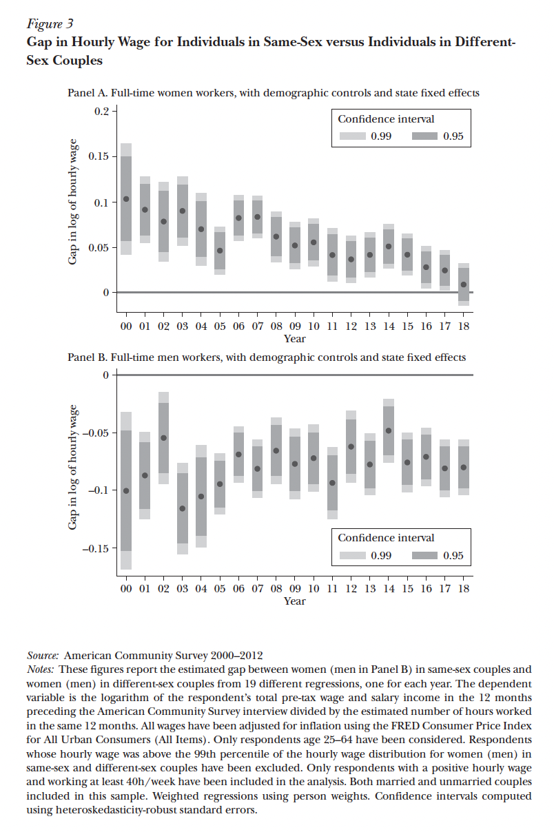
Spoiler: Badgett and colleagues discovered that the “wage gap” men in same-gender couples experience has persisted over time (Panel B below – the bottom figure); but the surprising finding was that the “wage premium” experienced by same-gender women appears to have declined precipitously since 2000 (Panel A below – the top figure). This shocked me and was not a discovery I was familiar with. (And if you’re into reading the notes, read footnote 17 on page 163 and you’ll note that they observed this trend in the raw wage gap data, including or excluding outliers, even when part-time workers were included, and more.)
I had so many questions after hearing her discuss the finding. One immediate question is whether this is a question of straight women’s gains or lesbians’/same-gender couple losses. I think that’s actually harder to answer than it might feel like it should be. It might also be true that those identifying as in same-gender couples on the ACS (even over this short period of time) have changed, partially accounting for growth in younger and more racially diverse people reporting being in same-gender couples in the most recent data here. We know that is true for questions about sexual identity; so it seems logical that it would also be true for reporting on being a part of a same-gender couple.
But… that doesn’t necessarily explain the gendered effect here–why did the wage premium evaporate for same-gender women couples, but the wage gap persist for same-gender men couples? Yet, it’s also true that same-gender men couples are being compared with the highest earners here (heterosexual, coupled men) while same-gender women are being compared with the lowest earners (heterosexual, coupled women). So, part of me feels that this might be more of a story of gains among heterosexual partnered women than losses for same-gender partnered women.
I’m completely intrigued and I hope someone writes their dissertation on the issue. It’s important. And, if nothing else, it made me realize that I read less work by economists than I should. But… to be fair, there are fewer economists like Dr. MV Lee Badgett than there should be. And I’ll be the first to read more research in economics as that shifts.
Americans generally agree that mass shootings require our attention. They might even agree on the notion that mass shootings require interventions. One thing that really struck me when I started studying mass shootings with Tara Leigh Tober is that there is really less agreement on what exactly a mass shooting is. Not everyone studying mass shootings uses the same definition. And even when they do, they’re not all using the same data.
As a part of an ongoing project, Tara Leigh Tober and I have been putting together different databases used to assess mass shootings in the U.S. Regardless of how you define them, these things happen in the U.S. more than anywhere else. That’s not really in question. But answering the “How much more?” question receives just incredibly varied responses. Depending on which database you use, you could find databases showing that mass shootings happen approximately once a month in the U.S. to databases documenting more than one mass shooting per day in the U.S. It really comes down to a question of what qualities ought to be used to describe a shooting as “mass.”
A good deal of scholarship relies on the definition of a crime operationalized by the FBI referred to as “mass killings.” According to the FBI, mass killing incidents are those in which four or more people are killed by a single perpetrator. Building on this, some suggest that mass shootings are simply mass killings by firearm. (There are a whole host of mass killings involving other weapons. The number of options available for the variable used to identify weapon in the FBI’s Supplemental Homicide Report is horrifying.) As a technicality, the FBI actually now defines incidents in which three or more people are killed as mass killings, lowering their fatality threshold from 4 to 3. Despite this, a majority of scholarship continues to use 4 fatalities as an important and defining quality.
Beyond the numbers of people killed, mass shootings have been defined more narrowly to exclude a host of incidents meeting that definitional parameter but failing others. For instance, a good deal of scholarship on mass shootings excludes: (1) incidents with more than one shooter; (2) incidents that can be attributed to drug or gang-related violence or robberies; (3) incidents that occur as a part of other criminal activity; (4) incidents associated with family or intimate partner violence; (4) incidents that occur in more than a single location (something the FBI classifies as “spree killings”); and (5) unsolved incidents. The table below from our article summarizes some of the database definitional distinctions.
The thinking is that incidents that meet these much more narrow criteria are unique and different in important ways from incidents that might be included if we didn’t narrow the definition so much. The truth is, as far as I can tell, there is very little research examining how and why those incidents differ from others. And even if they do differ in meaningful ways, we have less information than we should because that sort of analysis is framed as “beyond the scope” by definition.
Five of the largest databases that are used by scholars, policymakers, law enforcement agencies, journalists and media professionals, and more to make claims about mass shootings are: (1) Gun Violence Archive, (2) data from theFBI’s Supplementary Homicide Report, (3) the more recently produced “Active Shooter Report” also produced by the FBI, (4) the Mother Jones database produced by Mark Follman, and (5) a database of incidents put together by Everytown for Gun Safety.
For this article, Tara Leigh Tober, Melanie Brazzell, and I downloaded all of the data from each database, looking specifically at years for which all five databases included data (in the article we look at data from 2013-2020). We wrote a script to attempt to identify incidents across databases. [The script did part of the work and we had to do the rest by hand.] We wanted to know, of the 3,155 incidents that were in at least one of these databases between 2013 and 2020, how many were in all five. We were also interested in the overlaps between databases more generally.
The database with the least restrictive definition is Gun Violence Archive. They include incidents with 1-2 shooters involving 4 or more gun-related injuries, not restricted by the number and type of locations, relationships, and motives. This means that the Gun Violence Archive data includes a LOT more incidents. We discovered 2,727 incidents that were in the Gun Violence Archive database, but none of the other four (see Figure 1 from the paper below). If you look along the bottom of the UpSet figure until you see the five dots connected to each other, that is the figure for the number of incidents in at least one of these five databases for the years we examined that were in all five databases… 25 incidents. 25 of the 3,155 incidents that were in at least one database were included in all of them. That’s only 0.008% of the incidents analyzed.
The data are a bit easier to look at if you exclude Gun Violence Archive because the injury (rather than fatality) threshold used to produce that database produces such a larger population of incidents. But, even when excluding GVA data, it was still the same 25 incidents that were included in all of the other four databases (see Figure 2 from the paper below).
Even when we looked only at those incidents meeting the 4+ fatality threshold, it was still the same 25 incidents, even though the total population of incidents decreases substantially if we only look at those incidents in which at least four people were not only shot, but killed (see figure 3 from the article, below).
This is a problem for many reasons. It ought to call into question a good deal of what we claim to know about mass shootings in the U.S. It is not a common practice in mass shootings scholarship to corroborate discoveries with different databases. But, here, we see that only a small number of incidents in some of the databases are in all of them.
In the article, Tara, Melanie, and I recommend a more inclusive definition, using an injury (rather than fatality) threshold of 4, including incidents with 1-2 shooters, and not discriminating based on the number of type of locations or assumptions about motives. We also advocate for including unsolved incidents as well. In a recent report Tara Leigh Tober and I put together for the Mass Casualty Commission in Canada (HERE), we argue for this same definition. We can and should still examine whether and how incidents meeting the narrower criteria differ from others captured by this more broad definition.
More data will allow us to look at different patterns. It will enable us to examine patterns in different types of firearm-related incidents injuring large numbers of people. It will help us to include incidents excluded by the narrower definition that should be examined as “mass shootings” as well, but are sometimes excluded. Consider that the recent subway shooting in NYC in which the shooter released a smoke grenade on a moving train, put on a smoke mask, pulled out a handgun, and fired into the smoke-filled train until the train came to a stop and the next station. It was a horrifying crime. Thankfully, no one was killed. But that also means that, according to many databases, that crime may have been awful, but it wasn’t a “mass shooting.” Our definition captures that crime. Our definition captures Columbine high school (an incident with two shooters). Our definition captures Sandy Hook (sometimes not included for two reasons: fatalities/injuries at multiple locations as well as part of the crime being associated with family violence). Lots of high profile incidents sometimes referred to as “mass shootings” are either not included in databases and scholarship on mass shootings, or are included with with an exception clause (as is the case for Columbine in the Mother Jones database, for instance).
I hope this article reaches a lot of people and helps us to recognize the value in a broader definition for this uniquely American problem. Below is the full citation and link again if you’re interested in reading more (it’s open access) and available for free to all.
Every year since 2013, Gallup has been releasing new data on the size and composition of the LGBT+ identifying population in the U.S. Measuring gender and sexual identities on this scale presents a host of challenges. My sense is that the figures that result are bound to be conservative estimates of the size of the LGBT+ population in the U.S. I aways chart Gallup’s data because I often make use of the figures in some of my courses and find it more engaging to look at figures than tables. So, I thought I’d share those here for anyone interested.
One important place to start with the figure above is asking what it might actually mean. I am not convinced that the story told should only be understood as one in which there are simply “more” LGBT+ people than there used to be – which might strike some as a recommended interpretation of the figure above. Some important scholarship does suggest a radical shift, of the “more than there used to be” variety. For instance, Danya Lagos’s recent article in the American Journal of Sociology, “Has There Been a Transgender Tipping Point? Gender Identification Differences in U.S. Cohorts Born between 1935 and 2001” (HERE), documents cohort effects illustrating shifts in the likelihood that individuals identify as transgender or gender non-conforming in later birth cohorts. Importantly, this work was only about gender, not sexual demographic shifts. But it’s an interesting question and debate. Do these shifts demonstrate radical change in the experiences of gender and sexualities over time, or are more people simply adopting identity labels than used to in the past? I’m not convinced it’s an answerable question, but I’m interested in the debate.
Despite this, as of 2022, Gallup documented that 7.2% of the U.S. population identifies as LGBT. This is a remarkable shift from the 3.5% they documented when starting this data collection process in 2012. There have been shifts in the way in which the question has been asked of respondents. And no doubt, this will frustrating demographers trained in the “if you want to measure change, don’t change the measure” school of demographic analysis. I’ve always found that mantra frustrating when used to justify continued use of questions and measures that might have worked in earlier waves of data collection, but become out of touch over time. Identities like race, gender, sexuality, and more are so interesting precisely because they transform – sometimes radically – over time. So too does a population’s understanding of those shifts. In 2012, during the first phase of data collection by Gallup, they did not trust cisgender heterosexual people to understand questions about their gender and sexual identities. So, the question offered was a “yes/no” “Do you identify as lesbian, gay, bisexual, or transgender?” But now, Gallup asks respondents to check all that apply.
And the menu of options has changed over time as well, invariably playing “catch-up” with the ways these shifts are happening on the ground. For instance, in the 2021 data (see HERE), respondents could check all that apply, but they were not offered two options respondents were offered in 2022 (“asexual” and “queer”) – both of these responses would have been captured by “other LGBT” in the 2021 data. Below, you can see that “queer” identities are claimed by about 1.2% of those claiming LGBT+ identities; “asexual” is claimed by 1.3% of those claiming LGBT+ identities.
As you can see below, it remains true that “bisexual” accounts for the lion’s share of shifts in LGBT identification (something I’ve previously written about with D’Lane Compton HERE as well as Mignon Moore HERE/HERE). It is also true, however, that this question is of the “check all that apply” variety. So, someone can select all, none, or some of the identities in the figure below which is why the proportions don’t all add to 100%. Gallup did not supply these data, but the proportions suggest that few people select more than one identity. Thus, we don’t know, for instance, what share of those identifying as “queer” here also identify as “gay” or “lesbian” or “transgender.” But, the proportions suggest that a majority of respondents selected one identity.
In the 2022 report (on 2021 data), Gallup provided a gender breakdown for how people of different genders responded to these identity options questions. This is something I have been interested in for a long time. But this year, Gallup did not report the data by gender. I’ll be writing them to see if they’d be willing to share those figures and update this post if I receive the data and able able to share those results as well.
Gallup still reports the data by generation labels (Gen Z, Millennials, etc.). But, as sociologists are largely moving away from considering generation labels demographically meaningful, I am reporting the data simply by age groups below. As was true in the 2021 data (HERE), it is still true that “bisexual” accounts for largest share of LGBT+ identities among 18-57 year olds. But “gay” accounts for the largest share of LGBT+ identities among those 58 and older. “Other LGBT” remains most represented among the youngest cohort still as is also true of “transgender” identification. And “gay” still accounts for a larger share of LGBT+ identities than “lesbian” for each age group depicted below (this may be in part due to the fact that people selecting “lesbian” may also select “gay” – though, as I mention above, I think this may account for a smaller group of respondents than we might think).
Finally, Gallup shared figures on the proportion of LGBT+ adults claiming different LGBT identities offered on their most recent survey. So, while the above figure reports on proportions of all Americanadults in the different age ranges claiming specific LGBT+ identities, the figure below charts the proportions of LGBT+ identifying American adults claiming specific LGBT+ identities on Gallup’s survey. You can see that roughly two thirds of 18-41 year olds identifying as LGBT+ identify as “bisexual.” That’s a huge proportion of LGBT+ identifying people and continues to recommend that we invest more time and resources in investigating bisexuals.
Another interesting fact that jumped out at me from the figure below is that the largest share of respondents identifying as “lesbian” are now 58-76 years old. About one in four LGBT+ identifying adults in the same in that age range identify as “lesbian.” The figures are much lower in all of the other age groups. It’s also really interesting that “other LGBT” accounts for the largest proportions of LGBT identifying respondents in both the youngest AND oldest age groups here – accounting for the least share of respondents in the middle age groups.
Finally, the share of LGBT+ respondents identifying as “gay” is highest among the oldest groups listed below. Almost half of all LGBT+ adults over the age of 76 identify as “gay,” while only 17% of those in the youngest age groups here selected that identity. There are a couple things that might be going on. Part of what is going on is that there are simply so many young people identifying as “bisexual” that are simply driving the proportions of all other LGBT+ identities down. But it means that the composition of the LGBT+ community is really interestingly stratified by age in ways that probably deserves a lot more attention.
Not much here is really “new.” But it’s always interesting to see the new figures as they offer one way of tracking shifts and transformations in gender and sexualities over time. Soon, I hope to be working again with D’Lane Compton and Mignon Moore examining shifts in “bisexual” identities using different databases. And, again we did not get to see Gallup’s data reported by state – something they used to report in the earliest years of the survey. Fun to see the newest figures. But I continue to wish they shared more or made their data more easily accessible so that we can answer some of the questions posed above (among others).
How many mass shootings did the United States experience between 2013 and 2020? It’s a simple question. And it seems like it would be easy enough to answer. But it isn’t that simple. There is not federal definition of “mass shooting.” The closest the federal government comes is with incidents the F.B.I. defines as “mass murders” in their Supplementary Homicide Report. Those are incidents that involve at least four fatalities, happen in a single location, do not involve a “cooling off” period, and more. Sometimes, scholars borrow that definition to define “mass shootings”, selecting only those that relied on the use of firearms (though even here, many do not count incidents that could be classified as gang violence, drug violence, family or intimate partner violence, those that include multiple shooters, or those that occur across multiple settings – so-called “spree killings”).
Different databases exist that rely on slightly different definitions, and they result in a different count. Because mass shootings a collection of mass shootings have been so horrific in the past few weeks, there will be lots of stories and claims about “how common” this problem actually is. And the truth is, regardless on your political goals or agenda, there’s a database for you.
This problem of definition has serious consequences and severely limits what we know about mass shootings. The best way of answering the “how many?” question is to say that any estimate we have is a conservative estimate; we just don’t know by how much.
The past few years, Tara Leigh Tober and I have worked to try to address this issue. As a part of this, we have a manuscript under review that examines just how much/little overlap there is between incidents in different databases. We hope to have this out soon. Spoiler, there’s much less overlap than you might think.
As a part of that work, it allowed us to provide an estimate of how many mass shootings occurred during a time period where for which we were able to collect data from all five databases – 2013-2020. Our findings documented 3,155 separate incidents in at least one of the five most commonly relied upon databases. One important caveat is that the definitions used to populate each of these databases are different. Below, I made a time-lapse map charting incidents over this period by date. 3,155 incidents displayed in about one minute. It’s horrifying. But it helps present the scale and scope of the problem in ways any of these individual databases on their own is not completely capable.
Collecting this larger body of data also allows us to appreciate new patterns in this uniquely American problem. For instance, beyond the “how many?” questions, we can start to look for patterns beyond the fact that almost all of this violence is committed by men (regardless of database or definition) (see here).
Just by way of example, below I charted frequencies of mass shootings by month for each year of data (see figure below). I shared it on Twitter, and thought I’d share it here as well. With a larger sample, appreciating patterns in this form of gun violence is more possible. Like other forms of violent crime, mass shootings are more and less common at different times of the year. These last few horrific weeks including the NYC subway shooting, a terrifying mass shooting in a mall in South Carolina, the white supremacist mass shooting at a grocery store in Buffalo, New York, and the school shooting at Robb Elementary in Uvalde, Texas. And since, 2013, mass shootings have been more common from May-August. The pattern is extremely consistent. But fully appreciating this requires a less restrictive definition.
Gun control is obviously a crucial component in addressing mass shootings. The Canadian Prime Minister just enacted new legislation that will put a cap on the number of handguns in Canada as well as a ban on assault rifles (HERE). This is an important move. And there are diverse gun cultures in Canada that will react to this news in different ways. Tara and I also wrote a report as a part of Canada’s Mass Casualty Commission as well (HERE). And there, we recommend the Canadian government collect data on mass shootings systematically and make those data public and easily accessible. We can do better.
Because we live in a data-saturated era, when we don’t have data on something about which we absolutely should, we should pause. Sometimes this results from a mismatch between incentives and resources – those with the incentive to collect the data lack the resources while those with the resources have no incentive. Sometimes the burdens of data collection make producing a data set on a topic unfeasible. Some kinds of data resist easy measurement—data that resist being categorized and classified. Finally, some data don’t exist because specific groups do not want them to exist. All of these issues play a role in data on mass shootings in one way or another. But they shouldn’t.
Gallup just recently released new estimates of the size of the LGBT(+?) population in the U.S. I have been writing about and tracking Gallup’s data for a while. Their new data are useful and allow us to dis-aggregate gender and sexual identity groupings within the larger figures they provide (something not always possible based on how they collected data in the past). I was disappointed that they did not provide any new state-level estimates for the relative sizes of LGBT populations in different states as that is something that deserves more work.
Interestingly, the new data do not rely on the yes/no question Gallup initially used to estimate the proportion of the American public identifying as LGBT. That initial question simply asked respondents, “Do you, personally, identify as lesbian, gay, bisexual, or transgender?” While this did not allow Gallup to separate the L’s, B’s, G’s, and T’s from one another, it was relied upon primarily to reduce false positives. As Gary Gates shared in a Gallup podcast from 2018, Gallup’s initial question “reduced measurement error” by specifically attempting to reduce “false positives”. That’s survey methodologese for worrying that cisgender and straight people may not think of themselves as having gender and/or sexual identities. As such, sometimes they respond incorrectly when asked about their identities. As Gates put it, “With the Gallup question, you’re not asking that group what they are, you’re asking what they aren’t. And they more or less know that. So they may not use terms like heterosexual or straight. But they know they’re not gay [or lesbian, or transgender, etc.].”
Perhaps as a part of education built into the survey design, Gallup now provides questions that allow people to select from a menu of gender and sexual identities, checking as many as they feel apply to them personally, similar to the shift on the U.S. Census question regarding race. This is exciting as it allows us to look into their data with a bit more depth than was previously possible.
As of 2021, Gallup reported that their most recent survey found than 7.1% of Americans now identity as LGBT. It might be more accurate to say that they discovered that 7.1% of Americans identify as “LGBTQ+” because their methodology shows that they incorporated a range of identity options volunteered in interviews, but not formally on their menu of options as “Other LGBT”. The examples they provide in their write-up are queer, pansexual, and same-gender-loving; but it seems like this is how people identifying as genderqueer, gender fluid, nonbinary and more would have also been coded. This is an impressive shift, continuing a shifting trajectory they have been following since 2012. It’s worth noting that they have violated the social science creed: “if you want to measure change, don’t change the measure.” But, it’s also true that when you are measuring identities that transform over time, sometimes old measures simply cease to be as meaningful. As new gender and sexual identities and cultures emerge, how we measure gender and sexual identities must also shift and adapt.
This is exciting and certainly a marked shift. The population of the U.S. in 2021 was approximately 332,915,073 people. 7.1% of that number is about 23 million people. And this is, in all likelihood, a conservative measure of the size of this population as the sexual piece of this figure rests on the dimension of sexuality on which social scientists have routinely received the lowest proportions being identified as members of sexual minority communities (the question is about identity, rather than, for instance, questions about sexual practices and behaviors or attractions and desires).
And yet, as I’ve previously written about with D’Lane Compton (here) and Mignon Moore (here and here), it’s also important to look inside the very diverse collection of identities included in LGBTQ+ to examine among whom these shifts are taking place. Within each of these categories, there is a great deal of variation. I always find looking at these data easier with figures than tables. And I sometimes use these for teaching as well. So, I graphed a few of their tables to consider the shifts they documented and gave us figures for below. I’ll share them here along with some brief commentary I think of when encountering them.
Above, Gallup provided their estimates of the share of the LGBT+ population of the U.S. who selected L, G, B, T, and/or something else (they label the something else’s “other”). Continuing a trend than goes back at least to the early 2000’s, bisexual identities continue to be the lion’s share of the change. For anyone studying sexual demography, that in and of itself is not all that interesting as it has now been the case for a while. But it might be interesting to measure shifts in the the size of that discrepancy in growth between, for instance, lesbian, gay, and bisexual identities over time. Also of note here is the fact that “lesbian” identities were selected less commonly than “gay” (though remember that in the figure above, for each identity category included, people of all genders are represented). Broken down by gender (in the binary way Gallup provided data on gender for this portion) is also interesting.
It is still true that “bisexual” is a more common identity than “lesbian” among women, but a less popular identity than “gay” among men. I have written on this before. We also see here the proportions of women selecting “gay” and “lesbian” (though of course, they were allowed to select both in these data as they were asked to check all that apply). I’m also interested in the slightly higher figure for women among those identifying as “transgender” in these data and the fact that women were also twice as likely as me to have claimed an identity coded as “other”. Finally, here too we see that a larger share of people (women and men) identified as “gay” than “lesbian.”
Catherine Connell and Elliot Chudyk have been interviewing people in the U.S. who identify as “lesbian” recently and I’m interested to see what they discover (see “The Lesbian Project” here if you’re interested). Among the things that stood out to me when I first encountered their call for interviews was the fact that they cast a wide net. Among those they were interested in potentially interviewing were men who identify as lesbian. While a small share of those identifying as men in Gallup’s data also checked “lesbian” (0.1% as Gallup reported), that number stood out to me. I’m happy that Gallup’s method of data collection allowed for that to be discoverable.
Gallup also continues to chart change by generation. But, as I’ve learned more about this from Philip Cohen, the arbitrary nature of generation labels is less productive than simply stating how old people are. Gallup reports their data by generation. Below, I simply graph the same data but simply state the age groupings for people at the time of the interview.
Similar to other data, the youngest adults surveyed have the highest proportions of LGBT(+?) identification in Gallup’s data. 20.8% of people between the ages of 18 and 24 at the time of data collection identified as lesbian, gay, bisexual, transgender, or some other identity other than straight or heterosexual. 10.5% for 25-40 year olds, and only 0.8% of those interviewed over the age of 75. But another fact jumped out at me when looking at the figure above – those not responding to the question. The response rate for this question among 18-24 year olds is the highest of any of the age groupings. Roughly half as many 18-24 year olds chose not to respond to this question when compared with all other four age groups presented here. Reading non-responses can be tricky. But it made me think of a paper published on NBER in 2013 by Katherine B. Coffman, Lucas C. Coffman and Keith M. Marzilli Ericson that I wrote about at the time attempting to provide novel ways of asking about sexuality in particular on surveys in ways that did not trigger social desirability bias or discomfort (even among people on anonymous surveys). Coffman, et al. discovered that directly asking people to identify as something other than heterosexual on a survey resulted in lower proportions of people identifying as something other than heterosexual when compared to an experimental group provided with an indirect method allowing them to identify as something other than heterosexual without having to report that directly on a survey. (I wrote about the study here if you’re interested.) I’m wondering whether a similar bias might explain some of the no responses among older Americans and if it’s possible that younger Americans are less uncomfortable with the direct response approach.
Finally, Gallup also provided data on the proportions of people in different age groupings identifying as LGBT+ (below).
Here, I think there’s less that we learn that is really new. Among the things that stood out for me is the fact that bisexual is the most popular identity listed here among people 56 years old and younger. But over 56 and bisexual is less popular than other sexual identities. The other fact that seemed interesting here to me is the fact that, among 18-24 years olds here, “transgender” was a more popular identity than “lesbian”, and only slightly less popular than “gay.” Now, it’s true that people who selected transgender here could also select gay and/or lesbian as well. But this seemed interesting. I also think that the fact that they had to code progressively more people as “other LGBT” as the ages got younger suggest to me that the menu of options they offered is becoming more limiting and might be less able to capture the diversity of gender and sexual identities moving forward.
Among the things missing from Gallup’s report and something I am in the very early stages of collaborating on with D’Lane Compton and Mignon Moore is an analysis of race. My work with Mignon Moore suggests that some of these exciting trends are particularly pronounced among Americans racialized as Black. It’s always exciting to see Gallup’s new data. But I’m always left wishing they provided more than they did as well.
Beth Schneider was the chair of my department the year I was hired and retired last winter. During the time I have come to know Beth, she quickly became one the models of the kind of feminist mentor and scholar I endeavor to be. But, before I knew her, I was pretty nervous to meet Dr. Schneider when I arrived on campus for my interview. What I later learned was that my initial interactions were sort of classic Beth. While hiring me, Beth also mentored me through the hiring process—with more than a bit of feminist panache. If you don’t know of her or her work, Dr. Beth Schneider is a sociologist of sexualities and gender (in that order, thank you very much). Here, I want to share a bit about her role in helping to produce an identifiable sociology of sexualities and to tell you about the “Beth Schneider Effect.”
Beth has had an unusually influential role in the production of a sociology of sexualities. Her impact affected scholarship in the areas she studied (workplace relationships, harassment, sexual violence, work on HIV/AIDS and AIDS activism, and more). But it also stretched far beyond. Beth is a field builder and has been making space for feminist scholars of and feminist scholarship on sexualities for decades. This is a quality that I’ve started referring to as the “Beth Schneider Effect.”
Sociological scholarship addressing sexualities has long existed. But we didn’t always have a section, with members, subspecialties, awards, and more. The figure below is drawn from D’Lane Compton’s archival research in JStor, looking back through published work in sociology journals. Beth received her PhD from the University of Massachusetts in 1981. While she was in graduate school, the numbers of published articles in sociology journals on issues to do with sexualities were small. They were so small that two grad students huddled in a university library could enumerate all of them with their fingers and toes with digits to spare. You can see that the period of growth in the field came after Beth received her PhD. Beth’s early work was ahead of the curve in this respect. And for anyone who knows Beth, this won’t be much of a surprise.
Beth’s dissertation research analyzed the sexualization of the workplace, comparing the experiences of heterosexual and lesbian women, focusing on everything from workplace affairs to sexual harassment and assault. It is as timely and important a topic today as when she first completed it. In the project, she found that many women in her study found sexual partners at work. The heterosexual women in her sample were more likely to partner with men who were their superiors while the lesbian women were more likely to end up with women who were their equals. She explained this as a logical outcome in gender stratified workplaces. Among the many aspects of this study that are noteworthy is that the dataset Beth produced included information from almost 300 lesbian women—an impressive sample today, but extraordinary at that time. And studies on lesbians were very rare, particularly in sociology.
In one of her first articles published from this study, Beth reports on her impressive sample of lesbian and heterosexual identifying women with a survey she sent out by mail. In that article, decades before #MeToo, she wasn’t surprised to find that women experienced numerous unwanted physical and sexual experiences at work. But Beth Schneider helped to identify the “recognition problem” wherein fewer women were willing to label the unwanted behavior “sexual harassment.” It’s a problem that continues to be examined today. A key finding in that portion of her research was that lesbian women were more willing than straight women to recognize and label sexual harassment as such.
I know this because I re-read Beth’s scholarship when I nominated her for the Simon and Gagnon Lifetime Achievement Award. But I decided to dive in the deep end after I found a copy of the job talk poster from when she came to our campus as a PhD candidate.
Beth gave her job talk at UCSB 16 days before I was born, on March 17, 1981. I mention this specifically because anyone reading this essay who is a scholar among my generation or younger entered this field on very different footing. Or perhaps it would be more accurate to say that we entered this field with an identifiable subfield to stand on in the first place. And a great deal of this is due to feminist scholars of sexualities like Beth. Beth was not alone. Indeed, there is a small group of scholars of her generation who had a Beth Schneider Effect of their own – on slightly different areas and among slightly different communities (with a heavy amount of overlap I’d guess). But here, I want to consider the Beth Schneider Effect Beth has had on the sociology of sexualities.
To date, there is little agreement on precisely how to measure a Beth Schneider Effect. We might consider citation records, reprints, article downloads, or presence on course syllabi. And while all of these measure influence, and Beth has notable achievements on each, none of these measures get at what I mean. None of those measures illustrate an individual scholar’s ability to create more seats at the table, or assemble the table in the first place. And it’s precisely that quality of Beth’s work in this field on which I reflect here.
I’m a sociologist, so it’s easiest for me to think through a puzzle like this with a bit of data. And it’s certainly not a random sample of data I’ll present here, but in an attempt to settle scholarly disputes over measuring Beth Schneider Effects that is perhaps in vain, I want to present some data that shapes one of the first ways I came to know Beth Schneider’s name and work. She served as the third Editor of Gender & Society. When I came out to give a job talk at UCSB, I looked back through the issues that came out under her tenure and noted the incredibly influential work published during her tenure. [A note: I realize Gender & Society is not a sexualities journal, but a silly thing like that would never have stopped Beth.]
This paragraph above is the conclusion to Beth’s first Editor’s Note. These notes range from 2-3 pages and they offer some insight into some of Beth’s vision for the journal and field. While Beth edited Gender & Society, she published 16 Editor’s Notes. Collectively, they are approximately two Gender & Society article’s worth of text – 15,912 words. I read all of them preparing for a presentation I gave on her work and influence. They’re beautifully written, and if you don’t know Beth, they’re a lovely introduction. Listen to the beginning of her first Editor’s Note:
“It is mid-September in Santa Barbara, California. A hummingbird is feasting at the Mexican sage, and the watermelon, cantaloupe, and peppers still grow in our garden... This year I am teaching two new courses (‘Lesbian, Gay, and Bisexual People of Color’ and ‘Feminist Politics and Policy’) and transforming two others (‘Lesbian and Gay Communities’ and ‘Contemporary Women’s Movements’). Preparing the materials for these courses has made me hunger for more systematic data collection on the undocumented activities of grassroots and community organizations and more sustained theorizing about the interconnections of the relations of sexuality, gender, race, and class… These courses reflect the complicated intellectual ground on which I currently stand, a conflicted place torn between the problematics and debates in feminist scholarship and those of queer theorizing and lesbian and gay politics. No doubt, some of these concerns will be addressed over the next several years in Gender & Society.“
Whether or not that last bit was meant as invitation or mandate, Beth was right. Many of these concerns were addressed over the next several years and continue to provoke scholarship today. And Beth played a crucial role in helping create a home for that scholarship. Indeed, Beth served as Chair of the Sexualities section of the American Sociological Association twice (2001-2002 and again in 2009-2012), was a member of the Editorial Board of Sexualities for a decade of her career, and mentored an impressive collection of feminist scholars who study sexualities and have gone on to have Beth Schneider Effects of their own as well. Her work as Editor of Gender & Society is only one piece of her impressive career. I focus on it here because it helps me to neatly illustrate the point I want to make about how much gratitude we all owe Beth Schneider.
When Beth edited Gender & Society, she encouraged people to call the editorial office at UCSB with questions and concerns in her Editor’s Notes. Can you imagine? Manuscript submissions came in by snail mail to the journal, where they were filed, mailed out to reviewers, mailed back to the editor’s office, reviewed, and sent back by snail mail back to authors. People read the hard copy of the journal, or thumbed through the volumes bound together in university library stacks. Today, Gender & Society dedicates fewer pages to Editor’s Notes. But when Beth was editing and scholars were more apt to read the journal cover to cover, Editor’s Notes helped provide some of the connective tissue out of which “the field” took shape. This provided editors a chance to tell readers about the types of work being submitted, to push scholars to engage with new work and ideas, to reflect on feminist issues of the day, and more. Beth did all of this and more. For instance, Beth encouraged more work on sexualities as well as work pursuing an intersectional perspective. And she deliberated publicly on how to encourage scholars to engage with these ideas. In one Note, she wrote,
“I [am] still… pondering how to encourage authors to take seriously what I believe to be a central feature of feminist sociology: the recognition of the complex relations of race, class, gender, and sexuality and how they shape every study undertaken, no matter what the research subject, methodological approach, or theoretical perspective…. I want to move toward a deliberate consciousness of these relations and processes on the part of our contributors, such that the analyses of their own findings explicitly explore and discuss these potentially challenging implications. As a reminder, no lesbian need be present to consider structure and relations of heterosexuality, and race is present in any study of white women.”
Beth consistently pushed scholars to consider sexuality as an integral part of the initial holy trinity of intersectionality: race, class, and gender. And whilst celebrating scholarship coming out in these issues, she also challenged some and pushed scholars to strive for more and called for a feminism that was explicitly and unabashedly anti-racist. In another Note, she wrote:
“Some [authors] are more attentive to the question of how to make sense of the question of these [intersecting] inequalities even in work not intended to tackle this question directly. The embeddedness of class and class relations seems easier to grapple with than race and race relations in most of these contributions, and this pattern generalized over time raises questions for me about how race continues to be taken for granted in research on, and/or by, white women.”
Many of these issues and others raised consistently and boldly by Beth are issues that remain in feminist scholarship today. This work helps to provide a sense of some of what I have come to understand as Beth’s mission as Editor, a mission that has guided her work and influence in the field more broadly as well.
All of this helps me to demonstrate that Beth consistently asked for more sexualities scholarship and wanted that work to be explicitly intersectional. But, to really document a Beth Schneider Effect, we ought to properly document it. To continue using Gender & Society as just one metric, I wanted to see if I could demonstrate some of what I thought might be true. So, I counted and coded all of the articles and research reports published in Gender & Society between the first issue in 1987 and 2020. And I also counted the number of those articles and reports that might legitimately be called “sexualities scholarship” really broadly defined (below). The gray columns illustrate numbers of articles and reports published, and the black columns visualize the number of those articles and reports that are centrally about sexuality/ies. This period shaded in purple illustrates Beth Schneider’s term as Editor.
A year prior to Beth taking over, Sage asked Gender & Society to move from 4 issues a year to 6. So, the work of editing the journal increased a bit as the journal provided more space for more work because of the journal’s fast success. Right in the middle of Beth’s editorship, Sage also started publishing Sexualities, an international interdisciplinary journal dedicated to publishing sexualities scholarship.
In fact, one of the early articles in Gender & Society on sexuality was Beth’s. In 1991, she published her important article in the journal on workplace sexual assault. Prior to her term as Editor, Beth got some early practice guest editing a special issue in 1994 on “Sexual Identities and Communities.” More articles were published in G&S on sexuality that year than any prior because of that special issue. Additionally, about a decade after her term as Editor, having clearly not had enough, Beth and Jane Ward (one of her graduate students who also served as a Managing Editor at Gender & Society while in graduate school) came back to guest edit a second special issue on “heteronormativity and sexualities.” And all of this work created a home for scholarship that has gone on to be incredibly influential.
Those data also give us the information to consider the proportion of work published on sexualities in one journal over time (see below). There is a bit of noise in these data. You can vaguely decipher an upward trend, but year-to-year, the data fluctuate; they’re not perfectly linear. And among the reasons they’re not linear, I’m arguing, is Beth Schneider. And herein lies one small piece of evidence for the Beth Schneider Effect she has had on our field.
The trend line on the figure above helps to visualize the bi-modal shape of the trend I’m documenting here. There are two peaks. The first begins when Beth published her first article in Gender & Society, continues to rise with her first guest edited issue, and is sustained during her tenure as Editor. The second appears to have been precipitated directly by Jane Ward and Beth’s subsequent guest editorship and special issue. The work in these articles does not necessarily cite Beth Schneider. It wouldn’t show up on many traditional metrics of scholarly influence. But this is a kind of feminist scholarly influence to which I think more scholars ought to aspire.
In addition to her many accolades as a scholar, teacher, and mentor, this is what I mean when I say Beth has had a “Beth Schneider Effect” on our field. No matter who you are or what you study, teach, or learn in sociology, if it has to do with sexualities, this woman helped to build an academic subfield big enough for you to find a seat at the table, and scholarly homes in which that work might be better appreciated. Sociology is a better place for having Beth among us.
Dr. Beth Schneider as an Assistant Professor at UCSB, circa 1986.
_______________________________ NOTE:This essay began as a talk I gave at Beth’s invitation at the American Sociological Association conference in August of 2019 on a panel celebrating Beth Schneider’s work in honor of her receiving the Simon and Gagnon Lifetime Achievement Award from the Sexualities Section of ASA. Since that presentation, I’ve wanted to do something more with this and decided to edit it to share as a public essay celebrating Beth’s work and legacy.
Apologies in advance for the abundance of baby name post recently. I had another thought after posting yesterday, tracing some of the names Lieberson, Dumais, and Baumann (2000) identified as following the pattern of androgyny they identify in their paper using baby name data from births of white babies in Illinois.
In Philip Cohen’s post, he identified the 25 least sex-dominant names in 2018. He was interested in the relative prevalence of parents selecting extremely sex-dominant names for their children and how that prevalence might have changed. But it made me think that, using that method we might also be able to trace the various patterns through which androgynous names become androgynous. So, I charted shifts in the numbers of babies (by sex) given each of the names Philip identified in his post (below).
If you look at these names, you might note that some follow similar trajectories. Look, for instance, at the trajectories of the names Finley, Oakley, Remy, Justice, Jael, Ocean, and Gentry, for instance (charted alone below). When Lieberson, Dumais, and Baumann wrote about androgynous names, they presented these names as “accidentally androgynous.” And certainly some androgynous names follow this pattern. The name “Jamie” might be an example of this. Jamie was a name given to both boys and girls in roughly equal number through about 1980 when it started to become a more popular name (still among both boys and girls) and then the name drops off dramatically for boys and becomes a “girl” name… until 2018, when it dropped in popularity enough among girls that it is again among the names that are less sex-dominant. That the name was selected for both boys and girls through 1980 could have been a product of “accident” in the way Lieberson, Dumais, and Baumann present it – parents selecting the name might not have intentionally selected a name because it was androgynous. Rather, the name might have simply become androgynous. But Finley, Oakley, Remy, Justice, Jael, Ocean, and Gentry do not follow that pattern.
These names all seem to emerge relatively rapidly and are used in roughly equal numbers to name boys and girls. This pattern might be an illustration of what androgynous names appearing not by accident, but by design–parents intentionally selecting androgynous names. I know many parents who intentionally selected names they felt were androgynous. Alex Haden wrote about the phenomenon in the New York Times in 2016.
I’m not aware of any studies that trace different routes to androgeneity in baby names (though that may be because this is well outside my research area). But that strikes me as an interesting idea. If names have different pathways to androgeneity, it might be the case that these different paths are connected to distinct fortunes of androgynous names. If there is a way to identify what we might call “likely intentionally androgynous names” from “likely accidentally androgynous names” for instance, we could look into whether the names have more longevity and whether they show gender asymmetrical paths following becoming more popular.
Some of the names appear to follow really different trajectories for boys and girls. Some look like likely candidates for Lieberson, Dumais, and Baumann’s argument about the contaminating effect of femininity for boys names. “Jamie” seems to follow that pattern most clearly from the names Philip identified. And “Dakota” might also follow this pattern (though I’m wondering if there’s a high-profile woman named “Dakota” who became prominent in the early 1990s – it’s too early, I think, for Dakota Fanning).
What’s difficult about this is that the names Philip identified are currently androgynous. And Lieberson, Dumais, and Baumann’s analysis examines the fates of androgynous names. We can’t see the fates of the names that were most androgynous in 2018 yet. It will take time for those patterns to be visible. All I’m doing here is examining the various paths each of these names took to becoming androgynous in 2018. But lots of these names appear to follow radically different paths to androgyny.
I don’t have any big idea, and I’m not pursuing this. But this time I read Lieberson, Dumais, and Baumann’s article, I was struck by their characterization of androgynous names as “accidental,” examining the “chance factors that affect the gender makeup of a name.” It’s not only chance factors that produce androgynous names. Some are androgynous on purpose. And I wonder if and how that might matter.
Looking at gender and gender inequality through baby name data is something I’ve posted about before. Recently, Philip Cohen wrote a smart post thinking through how to measure whether androgynous baby names are on the rise. And it started a conversation on Twitter in which Charles Seguin weighed as well. The ideas and conversation are all revolving around a paper Stanley Lieberson, Susan Dumais and Shyon Baumann published in the American Journal of Sociology in 2000 – “The Instability of Androgynous Names: The Symbolic Maintenance of Gender Boundaries.” It’s a brilliant paper. I love it for the simplicity of the argument.
The argument Lieberson, Dumais and Baumann make revolves around tracing a rise in androgynous names given to babies (using data for white births in the state of Illinois between 1916 and 1989). They analyze what they characterize as the “accidental ways” androgynous names develop, and “asymmetric growth patterns.” Among the findings described in the paper is a powerful illustration of the cultural devaluation of femininity. As Lieberson, Dumais and Baumann put it:
“A central assumption is that androgyny is evaluated differently, depending on whether parents are naming a daughter or a son. We have seen that parents of daughters also respond to the number (or percentage) of boys with the name, but they are slower to retreat from using it. As a consequence, androgynous names end up as a predominantly female name more often than as a predominantly male name.” (HERE: 1282).
Philip charts a slow increase in the proportion of U.S. babies given names that are not sex dominant in the extreme. Charles Seguin is working on a paper analyzing this in much more sophisticated detail than I am here. But it made me go back through Lieberson, Dumais, and Baumann’s article to look at the names they identified among white babies born in Illinois to look at those names among all babies born in the U.S. and over a period of time that stretches farther in both directions.
They identify a collection of the 45 most androgynous names in their sample. And Philip developed a similar list, using national data for 2018, identifying a list of the 25 most common names that were given between 40% and 60% baby girls born in 2018. I’m really excited to see Charles Seguin’s paper when it is published. Because the data available today are just a lot more comprehensive. It made me really appreciate Lieberson’s A Matter of Taste in a whole new light, thinking about how he must have dug up all of those data on name trends, how much of it might have been transcribed, etc. It’s really impressive.
Lieberson, Dumais, and Baumann graph a collection of these names to illustrate the trend they identified in the article–the contaminating effect of femininity. Those figures are below. The dashed lines chart proportions of girls given the name, while the solid lines show those proportions for boys. So, whenever you see the dashed line increase and the solid line decline, the name was effectively feminized (i.e., it became a “girl” name) and whenever you see the solid line rise and the dashed line decrease, the name was effectively masculinized (i.e., it became a “boy” name). Their point is that once a name becomes androgynous and parents realize that, they will retreat faster from those names when giving them to sons. Androgynous names, according to Lieberson, Dumais, and Baumann are “unstable”–they argue that androgynous names that achieve a certain level of popularity don’t remain androgynous and that they’re much more likely to tip toward girls than boys because of the cultural devaluation of femininity.
It got me thinking about their puzzle. I love teaching it. It’s such an awful example of gender inequality. And it’s so simple. But I’d never charted the names on their lists against national data. So, I did that. And in general, it produced similar results. Of those 12 names, Lieberson, Dumais, and Baumann showed three that were masculinized over time (Angel, Sean, and Corey). National data show similar results, but added another name that looks different in the Illinois data they collected: Cary. In national data, baby boys named “Cary” did decline after 1960, coinciding with a small increase in the number of baby girls named “Cary,” but the lines didn’t cross the way they do in Lieberson, Dumais, and Baumann’s data. Still, 8 of these 12 names were feminized.
I don’t know how to identify threshold effects in data like these. But I’m struck that this might be useful. Philip’s post charts an increase in U.S. parents giving their children names that are less sex-dominant than they used to. But, to examine whether this trend will also shape the fortunes of these newly androgynous names is more difficult because we have to wait to see what happens to the names.
Because Charles Seguin goes by “Charlie” and Philip identified “Charlie” as the most popular androgynous name given to babies born in the U.S. in 2018, we thought through various iterations of names given to babies beginning with “Charl.” And this is the other point that makes studying the fates of androgynous names given to children today or recently more difficult. Lieberson, Dumais, and Baumann suggest that androgynous names often become androgynous in an accidental sort of way. Many parents today intentionally select androgynous names for their children. And Charlie is an interesting example, because there is more than one option for thinking through how to spell the name. Below are a few options along with frequencies of births to boys and girls given each name over time.
Charles also suggested that “Noa” was a name he thought was going to become a much more popular androgynous name – interesting because the name “Noah” was the second most popular name given to baby boys in 2018. Interestingly, both names started to ascend in popularity right around the same time – around 1995.
I don’t have an argument to make here. I’m just interested how the trend toward the increasingly intentionally androgynous naming of children might affect the relative stability of androgynous names over time and whether we will continue to see asymmetric contamination effects by gender.
I’ve been tracking shifts in the proportion of U.S. babies given top ten names among boys and girls since 2015. I think it’s a really fascinating trend and I use it some of my classrooms. The basic lesson is that popular baby names used to be a whole lot more popular than they are today. And the gender gap in just how popular the most popular baby names are has shrunk over time. As of 2017, for the first time since we can measure it using data from the Social Security Administration, the trend lines for girls and boys crossed. Since 2017, the top 10 most popular girls names are more popular than the top ten most popular boys names.
In 2019, I learned that I was not the first to notice this, or the first to graph the proportions of Americans giving babies top ten names to their boys and girls. Andrew Gelman published a piece in the New York Times in 2013 on the rise the proportion of American boys given a name ending with the letter “n.” He also wrote a blog post including two graphs he wished NYT had used for the story. One shows the rise in the proportion of baby boys given a name ending in “n.” And the other shows the proportions of baby boys and girls given top ten names by year (through, I’m assuming, 2012). I edited my original post to link to and credit Gelman’s figure.
And if we go back a bit further, Philip Cohen looked at this trend among girls in 2009 in a Huffington Post article. While Cohen was not looking at the gender gap in name popularity, he was interested in the shifts in names and naming trends that relate to what Stanley Lieberson referred to as the “modernization theory of name trends” in A Matter of Taste. Cohen was interested in both which name were most popular contemporarily vs. in the past as well as how the level of popularity of those popular names shifted over time.
Gelman’s more central discovery about the rise in the preponderance of boys given names ending in “n” was revisited again with a really cool animated visualization by Kieran Healy showing shifts in the distributions of last letters of boy and girl names among babies born over time. You can see the rise of “n” on the figure for boys and the steady dominance of names ending with “a” and “e” for girls.
Anyway, consider this my annual update on the trend Gelman identified in 2013 on shifts in the proportion of the prevalence of top ten baby names given to boys and girls as of 2018. The trend from 2017 continued. Top ten girl names remain (just slightly) more popular than top ten boy names, reversing a huge a very long-standing trend. Here is the updated figure.
And here’s a figure that looks only at the figure since 2000.
Smart stuff. I enjoy following this trend each year along with all of the other things we can consider just by looking at baby name data.
As more and more surveys are including questions attempting to capture the size of the LGBT identifying population in the U.S., I’ve been interested. I’m interested in the measures being used, what they’re able to capture, how those estimates vary when we compare surveys, and the specific wording of questions used.
In the past few years, Gallup’s estimates (after partnering with The Williams Institute and Gary Gates) have received an incredible amount of attention. Reporting on the most recent wave of data collected, Gallup reported that 4.5% of the U.S. population identifies as LGBT. It’s a bold claim. And, as with most estimates, it is most likely a conservative estimate.
Because of how Gallup asks this question, we cannot disaggregate lesbians, gay men, bisexuals, and transgender folks from one another. They’re just lumped together. And much of the reason for this is… wait for it… probably best blamed on straight folks. Why? Designing survey questions that can reliably and accurately assess sexual identities is challenging for lots of reasons I’ve discussed before. But one reason worth noting is that straight folks – heterosexual people – are among the biggest hurdles. Enough heterosexual people cannot make sense of questions inquiring about their sexual identities that we worry about “false positives” (straight people not knowing how to answer and responding that they are “bisexual” or “lesbian” or anything other than straight not because they identify that way, but because they don’t understand the question). Read (or listen to) how sexual demographer Gary Gates puts in when talking about the simple question Gallup has asked survey respondents in two waves now:
“It’s a simple yes or no answer. One of the challenges that we’ve observed in measuring sexual orientation, and this may sound humorous to people, but heterosexuals often don’t know what their sexual orientation is and don’t routinely call themselves either heterosexual or straight. And so when you have questions where you’re asking people what they are, that very big population sometimes makes mistakes and it creates what we call ‘measurement error’ or ‘false positives.’ And it basically puts people in the LGB category that really aren’t…. With the Gallup question, you’re not asking that group what they are, you’re asking what they aren’t. And they more or less know that. So they may not use terms like heterosexual or straight. But they know they’re not gay.”
In the Gallup Poll, respondents are asked, “Do you personally identify as lesbian, gay, bisexual, or transgender?” The responses are a simple yes/no. And all because straight folks and cisgender folks are so likely to misunderstand the question and inaccurately report their sexuality (and possibly gender).
So, it’s a conservative estimate that doesn’t allow us to break the LGBT population apart as much as we might like if we’re interested in understanding where growth in the population is and isn’t happening. But, because Gallup collects such a large sample, they are able to report on state-level estimates of LGBT populations throughout the U.S. I’ve written about this before. I updated a figure I previously produced for a lecture I’m giving and thought I’d share in case it’s useful to others as well.
We know that states with larger shares of the population living in urban areas have higher proportions of LGBT identifying individuals. There is more than one hypothesis about why this is or might be the case. I’ve charted these data before, but I added a new element to the figure below. Now it charts proportion identifying as LGBT by state by proportion of the state population living in urban areas AND data points vary by size according to the size of state populations relative to one another.
Personally, I’m excited to see the 2017-2018 data (which I imagine might be released soon) because from the work I’ve been reading, a great deal of growth in LGBT-identifying population is happening in the South in the U.S. And on the figure above, few southern states are above one standard deviation above the trend line (with the exception of Georgia). I wonder what this figure will look like when we map the population with more recent data. I have a feeling things have changed and I’m interested to see how.
_______________________
Special thanks to Connor Gilroy for answering my RStats question on Twitter, enabling me to figure out the code.


 I don’t have an argument to make here. I’m just interested how the trend toward the increasingly intentionally androgynous naming of children might affect the relative stability of androgynous names over time and whether we will continue to see asymmetric contamination effects by gender.


